We watched some of The Hundred last night. We watched it the way we have watched so much cricket over the years: with the sound down slightly too low while having a conversation about something entirely unrelated. The experience reminded us that the on screen graphics remain a major source of interest for people who haven’t watched the competition before.
There are two main ways of watching cricket:
- Actively, paying attention
- Passively, almost ambiently
We like both, but the second is arguably more significant. Cricket is great for dipping in and out of and talking over the top of. It can provide a more social viewing experience than many other sports.
You don’t catch up with friends by watching a great film together. You catch up by watching Bula Quo! Nothing suppresses the social aspect of the viewing experience like having any desire whatsoever to follow what’s going on.
So that’s kind of how we watched Welsh Fire Men against Southern Brave Men: theoretically following the game itself, but mostly just talking about other things or remarking on tangentia.
Tangentia like the TV graphics.
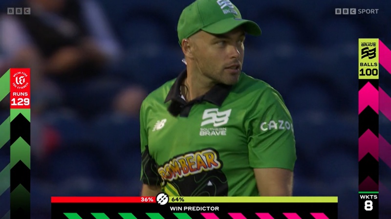
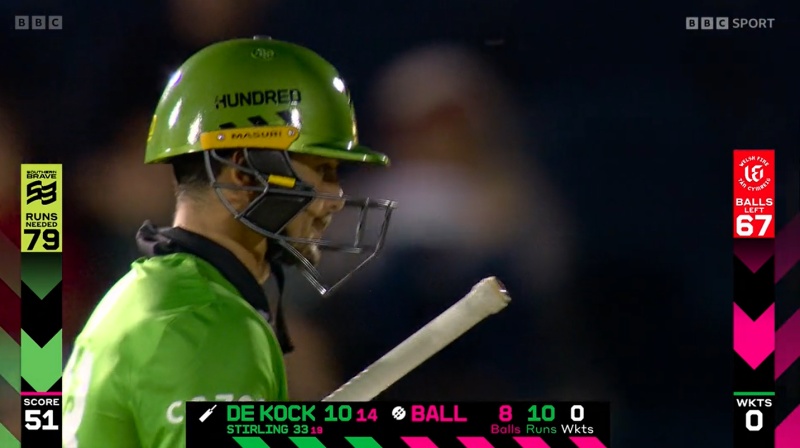
We mentioned the runs scored/needed versus balls faced/remaining sidebars last year. What we didn’t mention then was how they grow and then shrink as the game progresses.

So runs is the left sidebar and balls is the right one. In the first innings both go up. In the second they go down.
It struck us that in the first innings the right sidebar knows its destination is 100, so it can pace itself accordingly. The left sidebar though doesn’t know where it’s going to end up. It could finish at 129, as it did here, or it could finish at 200 or 80.
We wrongly assumed that it would finish exactly at the top of the screen so that midway through the second innings you could easily see what fraction of the target had been knocked off. This would involve a lot of careful recalibration throughout the first innings so that the bar wouldn’t creep up too slowly or shoot up too quickly.
That’s not the way it works though. It just moves at a standard pace and stops wherever it happens to be when the 100 balls are up. This may initially seem less exciting but it does raise the exciting possibility that a team could score so many that their team name would go off the top of the screen. That should definitely be the main goal for every team every season.
Our one big question isn’t to do with that though. It’s to do with the graphics relating to individual players that appear at the bottom.
Our question is… does every player get their own icon?

No, you’re puerile.


With the bright green, magenta and white on black and the fixed-width font, the graphics at the bottom of the screen remind me of Ceefax a little. Which I kinda like, to be honest.
We said exactly that last night. Our graphic designer friend said something about the colours being half a nanotone out or something, and then he said some more things about what that meant which we have now forgotten or possibly didn’t even understand in the first place.
See, I’ve only had 65+ years of being involved with cricket, so clearly I’ve not seen everything. But I can’t think of another version of the Glorious Game, or any other sport for that matter, where at least part of the match score goes downwards. Plus there’s no part of cricket scoring, in any format, that does that, anywhere.
Yet another negative of Harrison’s Folly.
Surely ‘runs required’ is the single most significant number as you move towards the conclusion of any limited overs game?
Of course it is. Inherent in every match ever played, not just one-day stuff.
But every player and spectator at any match knows that the side batting second/last needs more runs to go past the first side’s total to win. They don’t know, and almost certainly don’t care, how far short of a target the batting side is. Makes not a jot of difference. Plus no degrees in Difficult Sums are needed to work it all out.
Unless it’s a match from the Premier Division of Harrison’s Folly.
Not really sure what the point is here. The side batting first posts a total, then the other lot try and get that many runs + 1. The required rate is the exciting bit, isn’t it? With a few exceptions I rarely care about the actual result for more than five minutes after the conclusion of the game.
Can we please stop talking about the numbers and return to the central, puerile argument about name iconography.
I am reminded of the John Arlott quote about Bob Cunis. “Funny name, Cunis, neither one thing nor the other”. Any suggestions for Bob Cunis’s icon?
I struggle to get my head round runs required vs balls remaining. It should be straightforward but I find myself thinking of it in terms of runs per over.
Pints and litres if you will.
So the bars keep going down as the second inning reaches a hundred balls pulling everything with them? So when the game ends, does your TV shrink and become a point in the spacetime continuum?
When I was a child (no doubt Bob Patterson and some others here also remember this), television sets were operated through thermionic valves, not the modern transistor/silicon chip methods. When you turned off such a TV set, the image on the screen indeed disappeared into a dot resembling a point in the space time continuum.
A return to such decent values (or should I say decent valves) is long overdue in our society. It seems that the ECB recognises this and I for one applaud such forward thinking.
It’s a constant delight that we’re never really sure where the comments on this site are going to take us.
The EL34 was the favorite of Marshall amps owners. From memory the AC30 used 84s.
I love the smell of a hot guitar amp in the morning!
Ollie Robinson’s back!
Batters fail, change the bowlers. Plus ca change, Rodders.