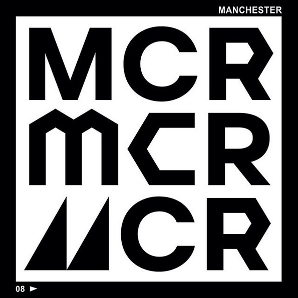
We’re not sure what’s going on here. Is this… good?
The Hundred is a competition that has been defined by thoughtlessness throughout its gestation.
Just one example: when they first announced that the format was going to be 100 balls, they hadn’t actually thought how they were going to break that down.
Setting aside the merits of five-ball overs (they aren’t called overs – don’t call them overs!), you’d anticipate questions about a 100-ball format, wouldn’t you? You’d make sure you had answers.
Not the ECB. The ECB offered up a “fresh tactical dimension” for public scrutiny. That is not something you’d do if you’d done any thinking.
There are other examples, but this is the purest. When it comes to The Hundred, a lot of things have happened without any thinking.
But then there’s this. It’s a small thing and an irrelevant thing in terms of the cricket, but it relates to the marketing of The Hundred and we honestly, honestly, honestly don’t think it’s completely shit.
That, to us, is newsworthy.
This is the thing
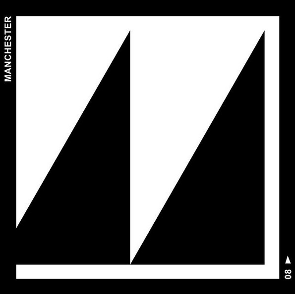
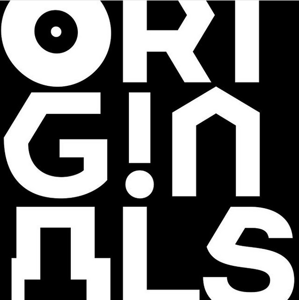
Whoever’s doing the design and marketing for the Manchester Originals team has come up with a special Manchester alphabet.
Here are some examples.
An M

According to the BBC, this M is a nod to the Factory Records logo. Factory was home to Joy Division, New Order, Happy Mondays and others and it was very Manchester.
The first office was on the road linking the palatines of Cheshire and Manchester (which is a roundabout but divertingly interesting way of saying it was on Palatine Road). After that, they moved into town, where they spent £35,000 on a table.
An O and an A

The O is supposed to be a record (it makes more sense if you invert the black and white), which is another reference to the city’s music scene.
The weird computer graphics A is a reference to the city’s industrial heritage. Not quite sure why. Square, blocky buildings or something. We’re not sure.
Some more letters

The M refers to viaducts because Manchester has viaducts.
The E is cobbled because Manchester has some cobbles and used to have lots more.
The C is a Manchester tart. (Not every town has to have a cake named after it.)
The S has a squiggle in it which is meant to be a canal (which is a bit weird, because canals are generally straighter than rivers).
The Y is for Manchester spirit, which is a bit imprecise and vacuous.
The Rose of Lancaster is on there too (not sure whether it serves as an alternative O or as a full stop or something) and then there’s a spiky round thing that we’re guessing is a mill water wheel because it’s meant to represent the city’s cotton industry.
The H with a loop above the bar looks sort of familiar, but we can’t think why. No idea about the slopy A. If you’ve any ideas about those two, please let us know.
Is that it? Is that the whole thing?
It looks like there are few more letters, but yes, that’s it. They’ve made up some letters.
All we’re saying is that the Manchester Originals people have at least given some thought to the fact that it’s nominally a Manchester team and they’ve tried to convey that in an interesting and relatively indirect way.
So, um, well done.


What sort of insane alphabet has two Ms and two As but omits several other useful letters?!
Oh dear, oh dear, oh dear.
I understand that you so want The Hundred tournament to be a success, KC, because you love cricket so much you would prefer to be proved wrong than to see English cricket pour so much of its money and potential down the drain.
My first reaction to the marketing bollocks around The Hundred was a little like yours.
But let’s face it. Like all true marketing-oriented initiatives before it, this only proves that all the thought has gone into the sizzle and none of the thought has gone into the sausage.
If it works, good luck to the ECB but please let’s not laud this particular example.
There are also dark forces at work in that so-called Manchester alphabet.
When I was at Old Trafford a few weeks ago we were served Manchester Tart and I asked about it. Keith Hayhurst, the Lancashire CCC historian, said he had no recollection of a Manchester tart when he was a young’un, so I looked it up.
One of the theories on Wikipedia was that the tart originated at a school in Leeds after the second world war. The second theory was that it is a variant of Mrs Beeton’s Manchester pudding.
When I looked at Wikipedia today, the Leeds reference has gone.
As a Wikipedia editor, I have scraped the relevant edits so KC readers can see the edits made, just three days ago, for reasons that perhaps the ECB (or the Manchester Originals franchise) marketing people could and should explain:
http://ianlouisharris.com/wp-content/uploads/2019/10/Manchester-tart_-Difference-between-revisions-Wikipedia.html
London Spirit wouldn’t dream of sinking to such depths of marketing depravity – not least because our marketing folk are too sozzled on Nicholson’s Gin to be arsed.
The H – an arch of Manchester Piccadilly station? Or a reference to the Ordsall Chord (which I just found while googling for arches in Manchester). Or the Hulme Arch bridge? Or the Manchester Piccadilly footbridge?
Marchester.
I think this is designed as some kind of Freudian test, a test which I have failed as all I see in the A and the O are genitalia. I guess that’s a metaphor for when this load of cock ‘n’ balls eventually goes tits-up…
Is there a nod towards the original graphic art for A Clockwork Orange? That would be a nice link to Salford.