How much worse?
One worse.
Having taken 6-77 in Worcestershire’s first innings, Adil Rashid could only manage 5-37 in their second innings. This grave loss of form is deeply worrying.
Ben Stokes is getting better
How much better?
125 better.
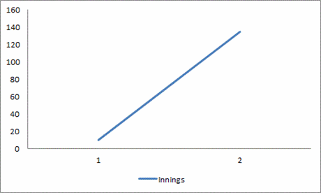
Having scored 10 in Durham’s first innings, Ben Stokes then made 135 not out in their second innings. We’ve plotted this on a graph for you:

You can really appreciate that this represents improvement when you see the data in this form.
Stokes took 6-68 in between those two innings, but we don’t know much about his bowling, so we don’t know how to feel about that.
We’re pretty sure that 6-68 is good, but without plotting it on a graph, we can’t be certain.


An outstanding start to this seasons ones to watch. It can’t go on like this.
Excellent graph KC, although I hope you’re not implying with your y-axis that 160 is the maximum Ben Stokes can score this season.
Talking of diagrammatical representations, it looks like something has caught on in other, less desirable sports.
http://footballvenndiagrams.tumblr.com/archive
Football Venns! We just did a little bit of a sick in our mouth.
This is what it must feel like to have been sexually abused for eight to ten years.
Is that joke in poor taste?
I’d say given the circumstances It’s justified.
OK, so technically those footie pics are venns, but where’s the beauty? Where’s the refinement? Where’s the intellectual rigour? Where’s the class?
It’s not that bad taste, I have heard worse jokes.
Dan – did I ever tell you my spinach joke?
However, with my avatar my opinion might not be a representative one.
Why isn’t the y-axis labeled? Now I have to read the article to understand the plot, which defeats the purpose.
That is not the Y-axis. It is the What-axis.
More seriously, that Stokes innings featured him hitting 31 off one over – no mean feat.
I love the fact that he hit 5 maximums off the first five balls and then too a single to keep the strike.
That’s proper cricket!